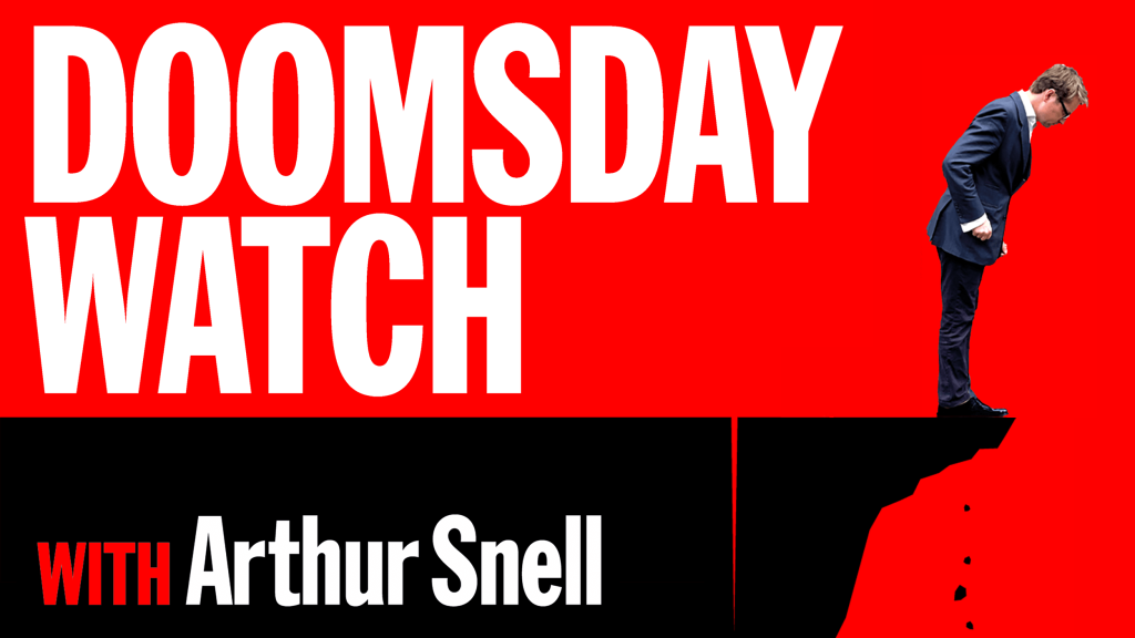
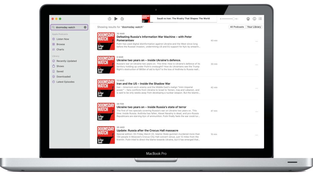
Doomsday Watch was a new podcast, so it was essential that the icon stood out amongst rivals. The real estate is tiny, hence the use of red and black, punchy type, and a bespoke graphic.
work / Podmasters


Apple’s podcast chart from December 9th, 2021

The thumbnail works in very small sizes

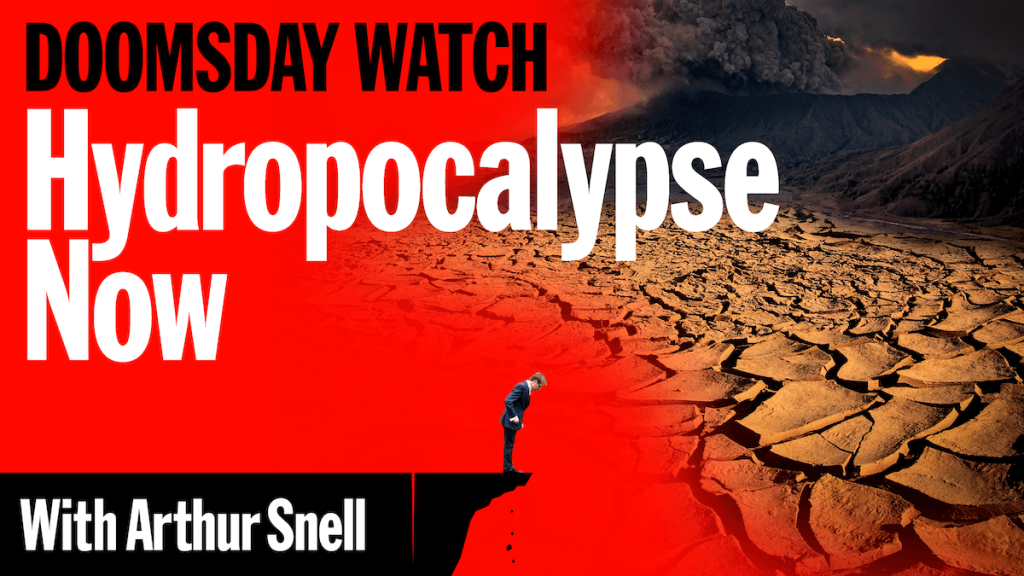
Sample episodics as used on Facebook


Get results like these
The launch was a hit, coming in at number three on the Apple chart. Renamed last year as This Is Not a Drill, it has racked up 106 episodes and two million listeners. Podmasters co-founder Andrew Harrison said, ‘Everyone loves the look and we are delighted’