
Into University is an award-winning charity devoted to social mobility. This project was to create a microsite (https://impact.intouniversity.org/) to show their impact through data viz, and a scalable map showing social deprivation down to postcode level.
work / Into University
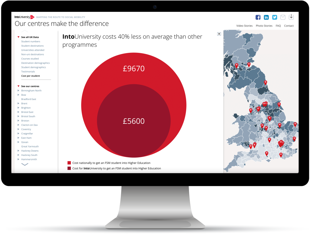
Into University delivers outstanding results
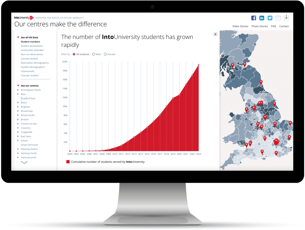
Total numbers of Into University students have soared
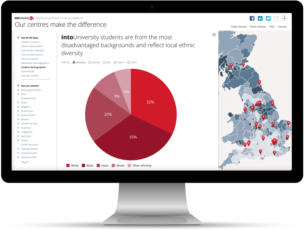
Dynamic data viz shows the background of every student
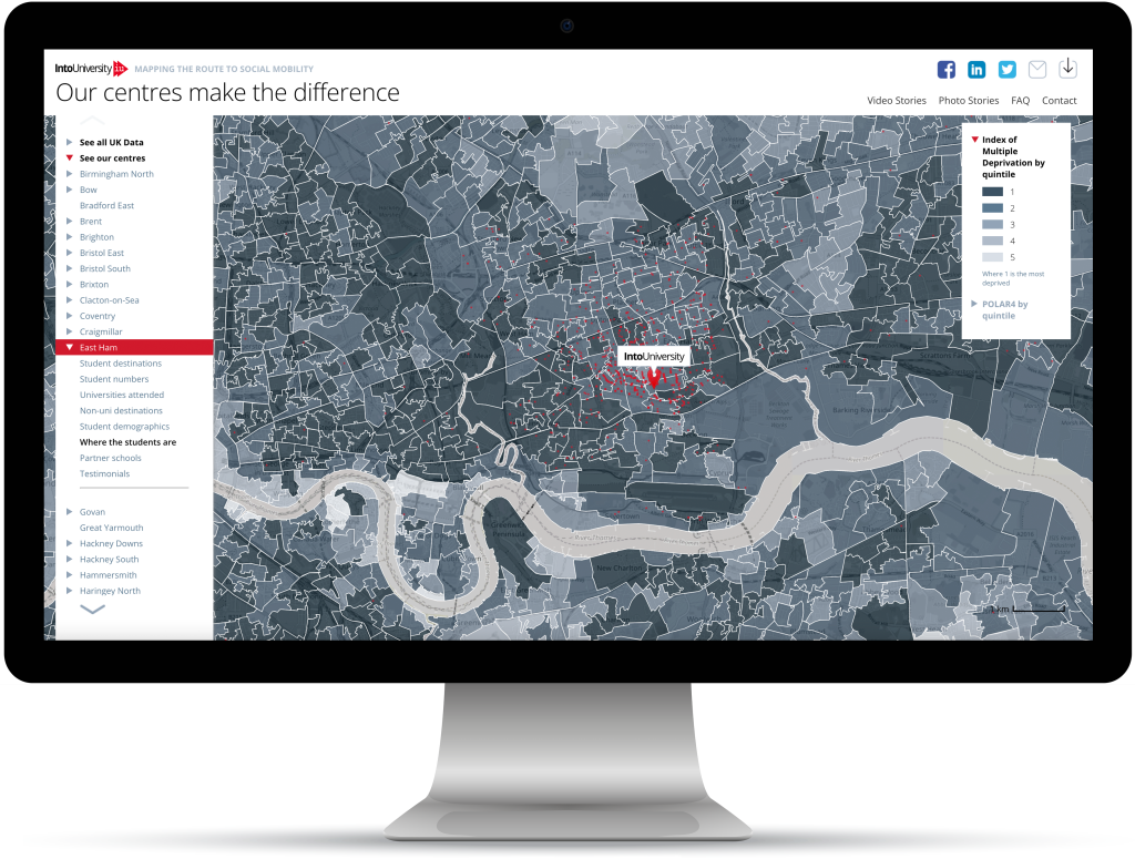
Every student is mapped against the centre location and separate deprivation indices
Get results like these
Chief Strategy Officer Dr Hugh Rayment-Pickard said: ‘To our knowledge, we are the first charity to have tried anything this ambitious.’ Head of Fundraising John Bleasdale said ‘We’re just delighted with the response to this innovation’.